DesignJune 3, 2026· 6 min read
Designing emails that look like your channel
Your newsletter is a brand surface subscribers stare at with full attention. Most creators waste it on a stock template.
D
The Newlett team
Newlett editorial
Your newsletter is a brand surface subscribers stare at with full attention. Most creators waste it on a stock template.
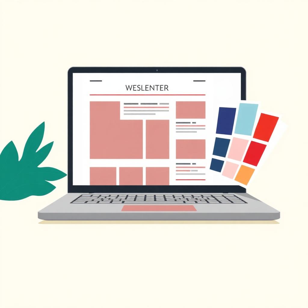
Open the average creator newsletter and you could swap the logo with any other channel's and nobody would notice. Same template, same layout, same gray footer. Which is strange, because these are people who will spend nine hours color-grading a thumbnail.
The inbox deserves the same care, and for one specific reason: attention quality. Someone scrolling a feed gives you a fraction of a second. Someone who opened your email gave you the whole screen on purpose. Design does a lot of quiet work in that moment.
Well over half of creator newsletter opens happen on phones, most of those in dark mode, many with images off until tapped. So: alt text on every image, a layout that reads in one column, and buttons big enough for thumbs. Send yourself a test and read it on your phone in bed, because that's where your subscribers are reading it.
Every element between the reader and the video is friction. The social icon cluster, the fancy header banner, the 'view in browser' ceremony: all of it pushes the thing they opened the email for below the fold. Get to the video fast, then earn the scroll with the writing.
The good news is that this is a one-time decision. Set the colors, the type, and the layout once, and every future issue inherits it. Brand consistency is one of the few design problems that automation genuinely solves.
Your uploads, in your subscribers' inbox, without lifting a finger.
Try Newlett free